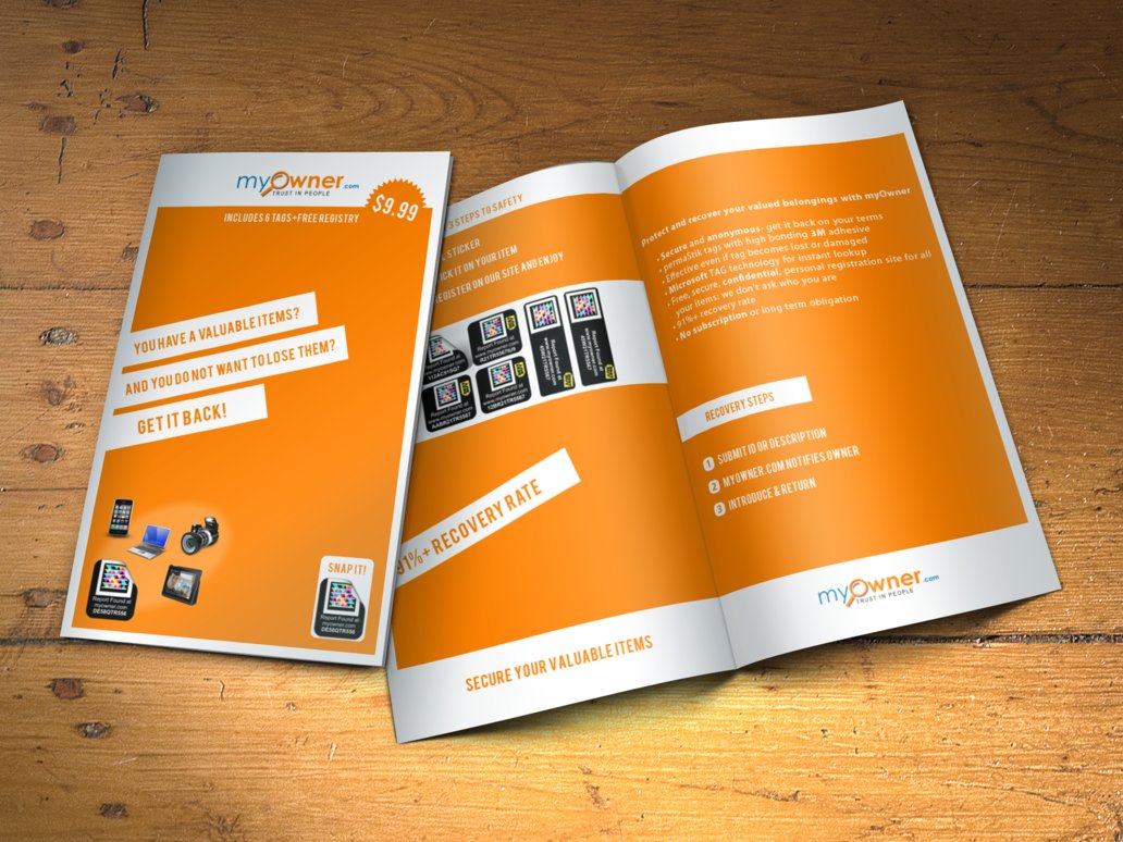
A lot many organizations can design brochures but do they all lie in the category of great brochure designs? Most certainly not.
The companies dealing with brochures, stationery and packaging design in Dubai argue that there’s more to a brochure than just being pretty. The aesthetic demands need to be met with the business needs and only then will the brochure stand out.

Let’s go through all the elements that make up a brochure design that is better than the best.
1. Heart of the Brochure – Front Cover
The number one goal of the front cover is to be so aesthetically alluring that it should grab the target audience’s attention right away. It should also have the ability to emotionally connect with the audience, with a powerful message display that makes them inquisitive about reading the rest of the brochure too. This is where most companies are left behind. Instead of creating a connection, they focus on just the aesthetics of it.
2. Soul of the Brochure – Flaps
Since we just categorized the cover as the heart then the inside will be the soul of the brochure. Now that the reader is in and you have his attention, capitalize on creating punchy taglines, content that is a real head-turner and is catchy. Just keep the goal of your brochure in mind and be creative about briefly presenting the concept that it doesn’t bore out the customer.
3. Unique Pages – Contents
It is important that the contents of the brochure are equally engaging. Brochure design Dubai based companies ensure that the emotional connection created with the readers earlier, with the cover and flaps, shouldn’t end. Give that emotionally stimulated reader something meaningful to read. Even if you are offering services, explain how your offerings can make their life better. Be a problem solver and a solution provider rather than just a seller who is determined to sell services to the customers. Creating meaningful connections always pays off well.
4. Aesthetic Wallet – Back Cover
This is the last step where you need to ensure that the reader buys what you have to sell and gets in touch with you. So devise a well thought-out call to action alongside your website, contact email, contact number, physical address, your existence on social media platforms, discount codes, or any other important detail that will help your customer to easily get in touch with you, find out more about you and pay you off. Don’t make this simple job difficult for them. With all the hard work that you did in capturing their attention, keeping them engaged and making them understand everything, now is the time to ask for something return. You have rather earned their permission, which is why they are on the back cover, also known as the wallet as this is where you ask the reader for money. Make the most of it!
Most of the brands believe that a brochure design just has to be pretty, which does not stand true in its entirety. It has to has the aesthetics supported by business objectives reflected by the above mentioned elements properly induced – this is the perfect formula for a great brochure design.
Author Bio: Mariya Sabeen Irshad (@MariyaSIrshad) is a Creative Writer by passion and a Content Marketing Strategist by profession – a tech-savvy who is currently associated with Dubai Monsters, a creative design studio. With an MBA in Marketing, she holds relevant industry experience and writes about digital marketing, mobile applications, web designing, career counseling, game development and trending technology news.

